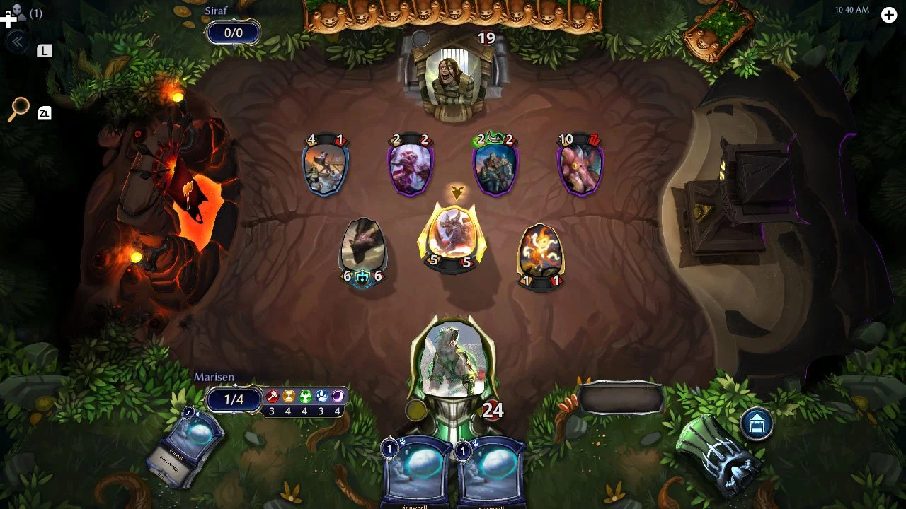
My primary role on the UI for Eternal Card Game was to support new feature development while refreshing and modernizing layouts and the treatment of graphic elements. The overarching goal throughout these updates was to let the UI art elements take a back seat to let more important elements take the front such as badges, avatars, rewards, etc. In the updated screens, frames were removed, important elements where emphasized, and information layouts simplified.
ETERNAL
UI Reskin
Key UI screens such as the Draft game mode buy-in menu were over cluttered with UI embellishments and constrained layouts. In my updated version of this screen I’ve removed unnecessary graphic elements to allow room for the animated key-art to shine. Previously the layout was broken out into smaller chunks to allow plenty of breathing room on the screen to allow the eye to rest.
Before: Too many boxes, avatar portrait is contained in an awkward frame.
After: Opened up the space around the contents, grouped data, gave room for avatar to breathe
Before: Small illustration with poor crop, overly centered composition
After: Filled the screen with colorful illustration, moved UI out of the way, gave action buttons priority
Before: Too many framed elements, list of avatars is limited without scrolling
After: Expanded the number of elements visible without scrolling, expanded area for illustration, added tab navigation to simplify screen flow
Tournament UI/UX
Eternal’s robust tournament system required the UI to display complex and dynamic information for several configurations.


