DUNE: IMPERIUM
I worked as the principal UI artist and art director on the digital conversion of the award-winning board game, Dune: Imperium. Having also worked on the original board game, it was an exciting opportunity to bring the game to life in a video game format.
Gameplay UI Exploration
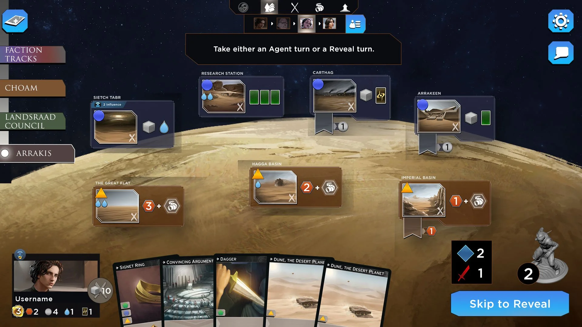
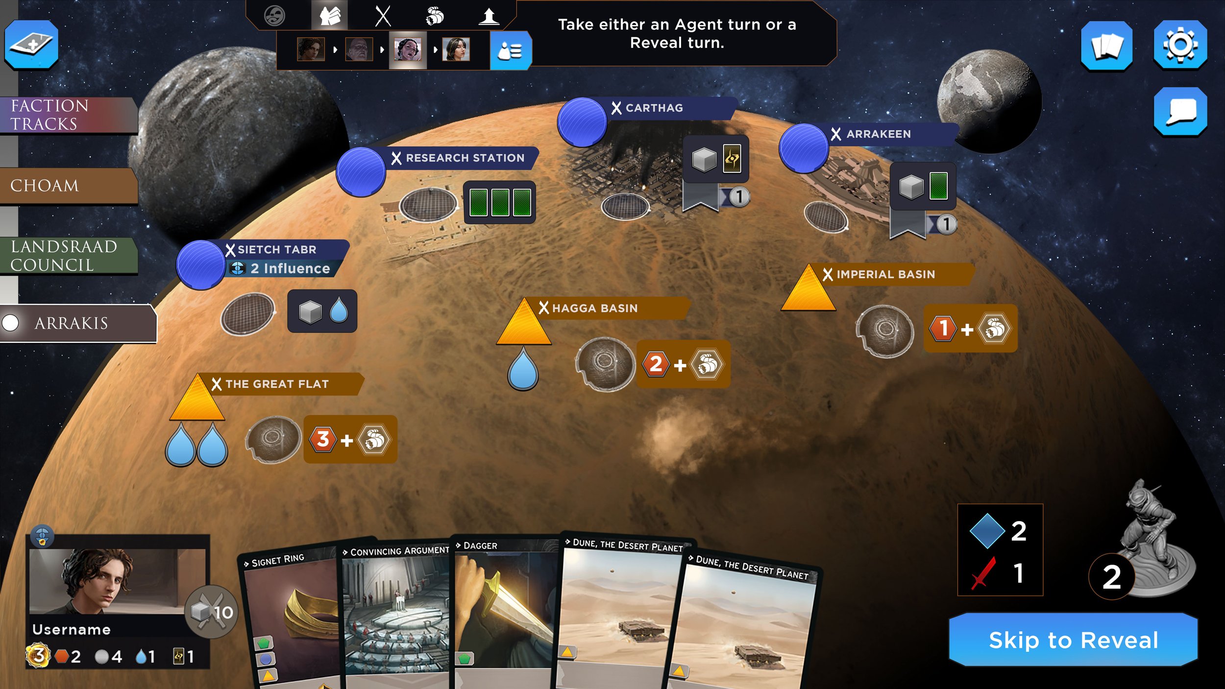
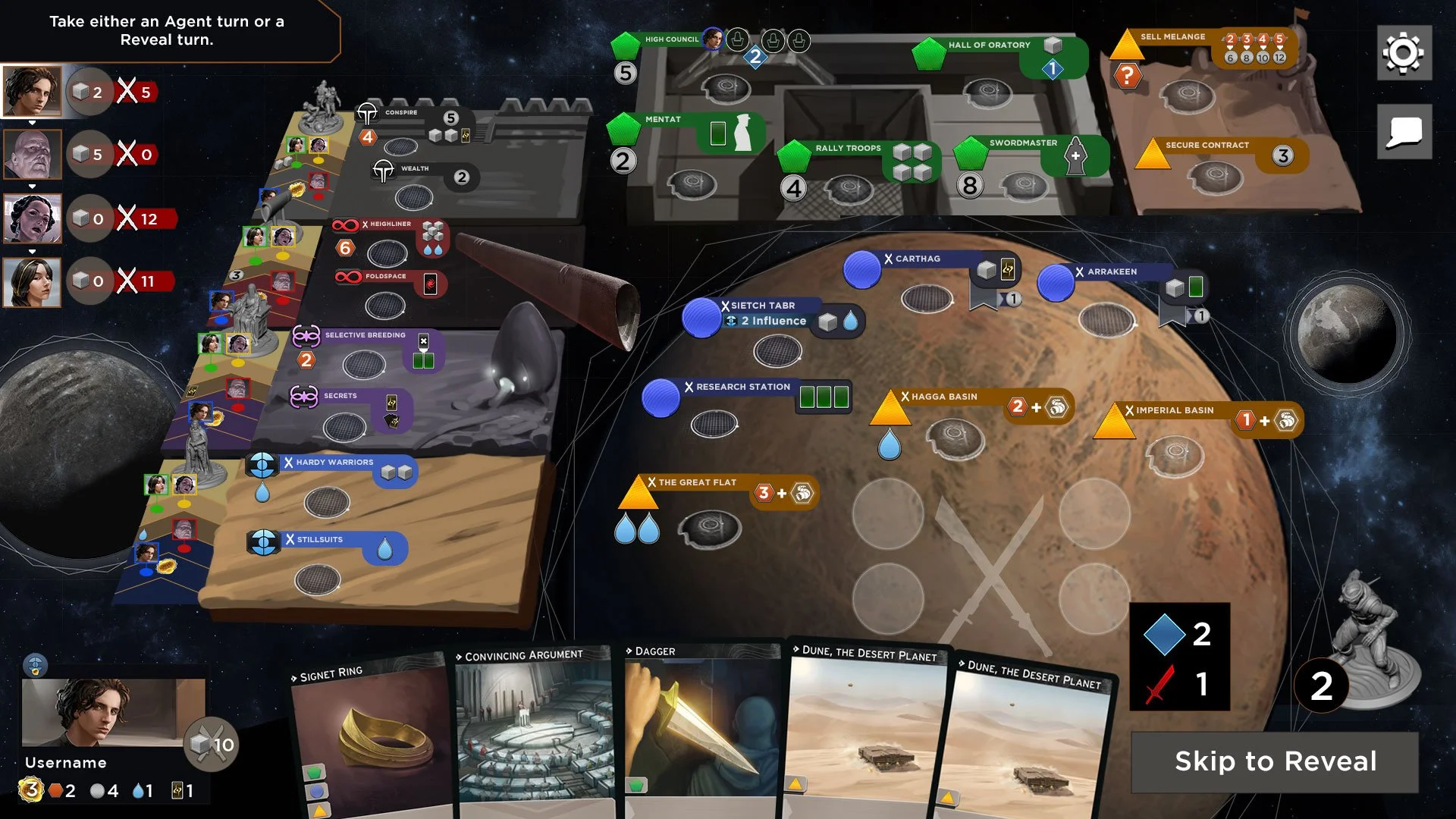
My main goal with the UI design was to offer a familiar layout of the game board while also making it feel like a video game. In the explorations below, I start with low fidelity graphics in order to allow for quick layout exploration and iteration.

Board section focus with minimized faction tracks
Slight reduction of size and reposition of requirements
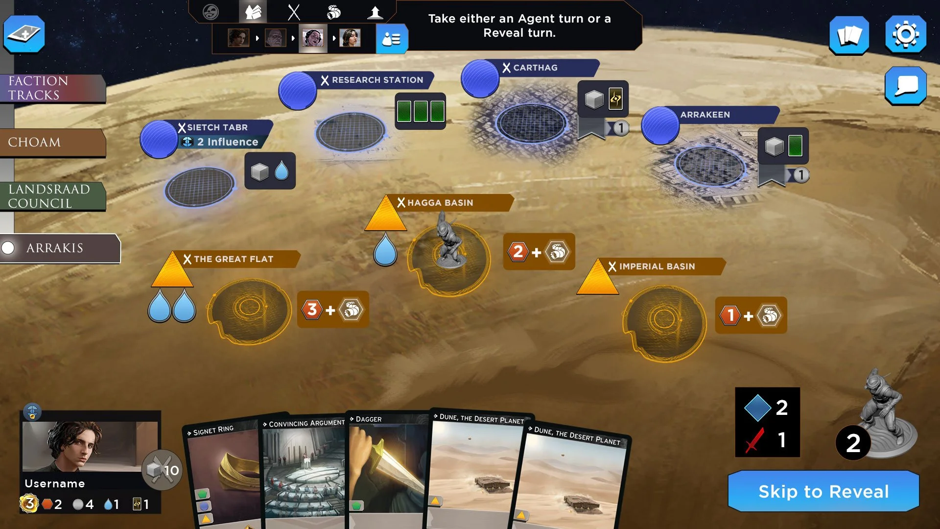
Locations placed on the planet, removed space illustrations
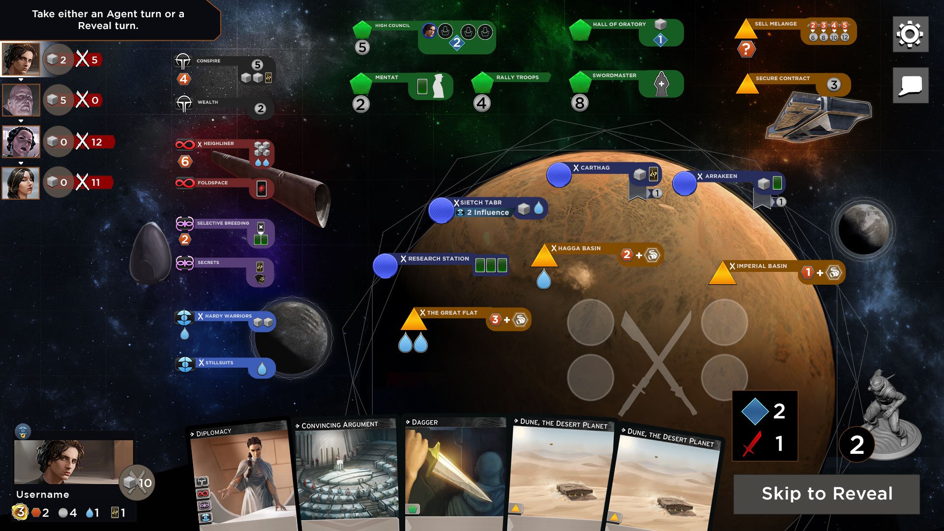
Board space on map, zoomed out more, addition of sand worm

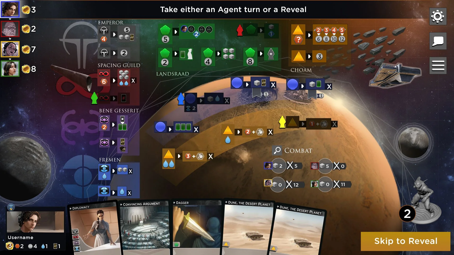
Zoomed out view with focus on faction tracks
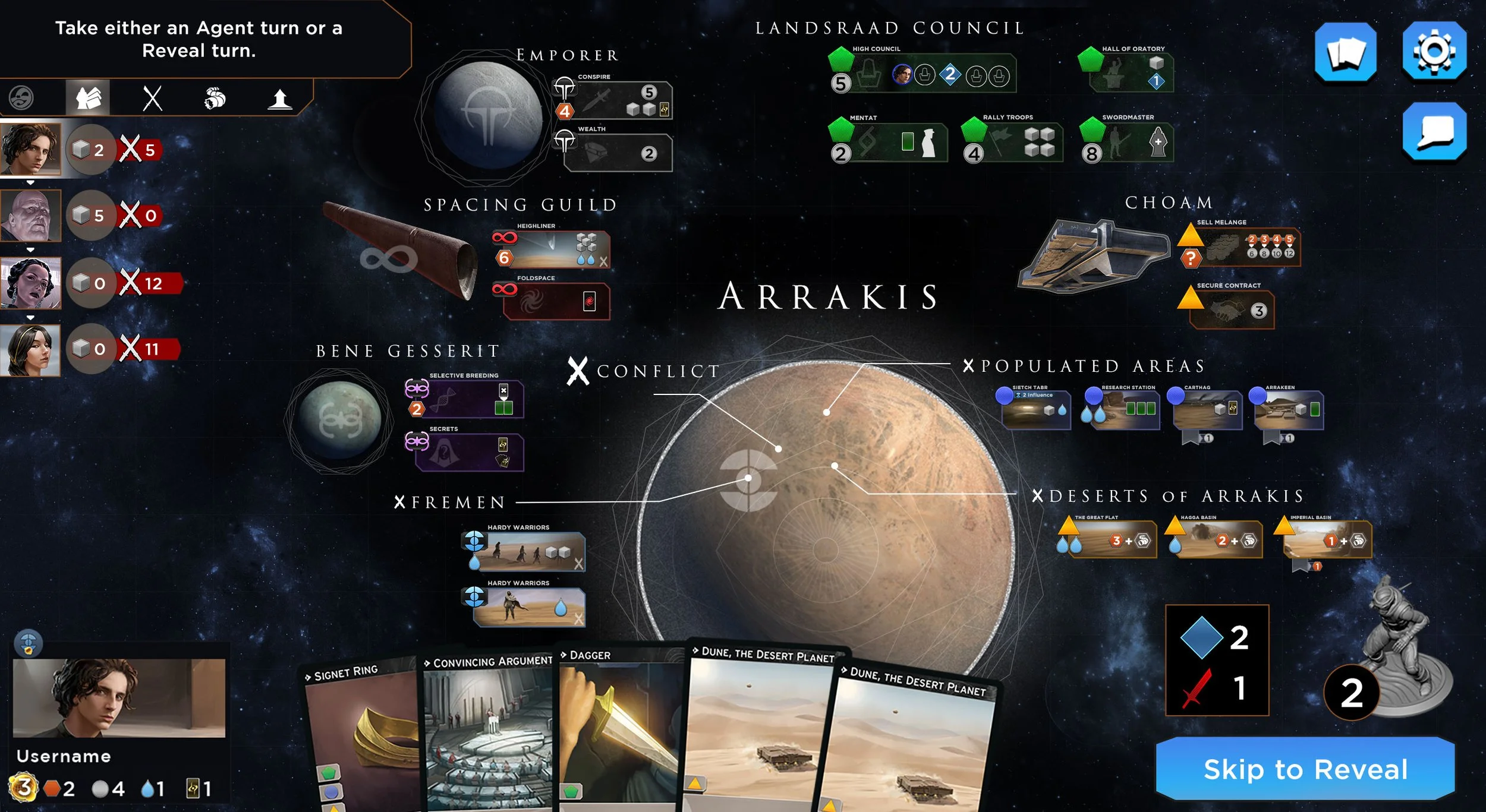
Brining all of the board spaces in at once, star chart approach
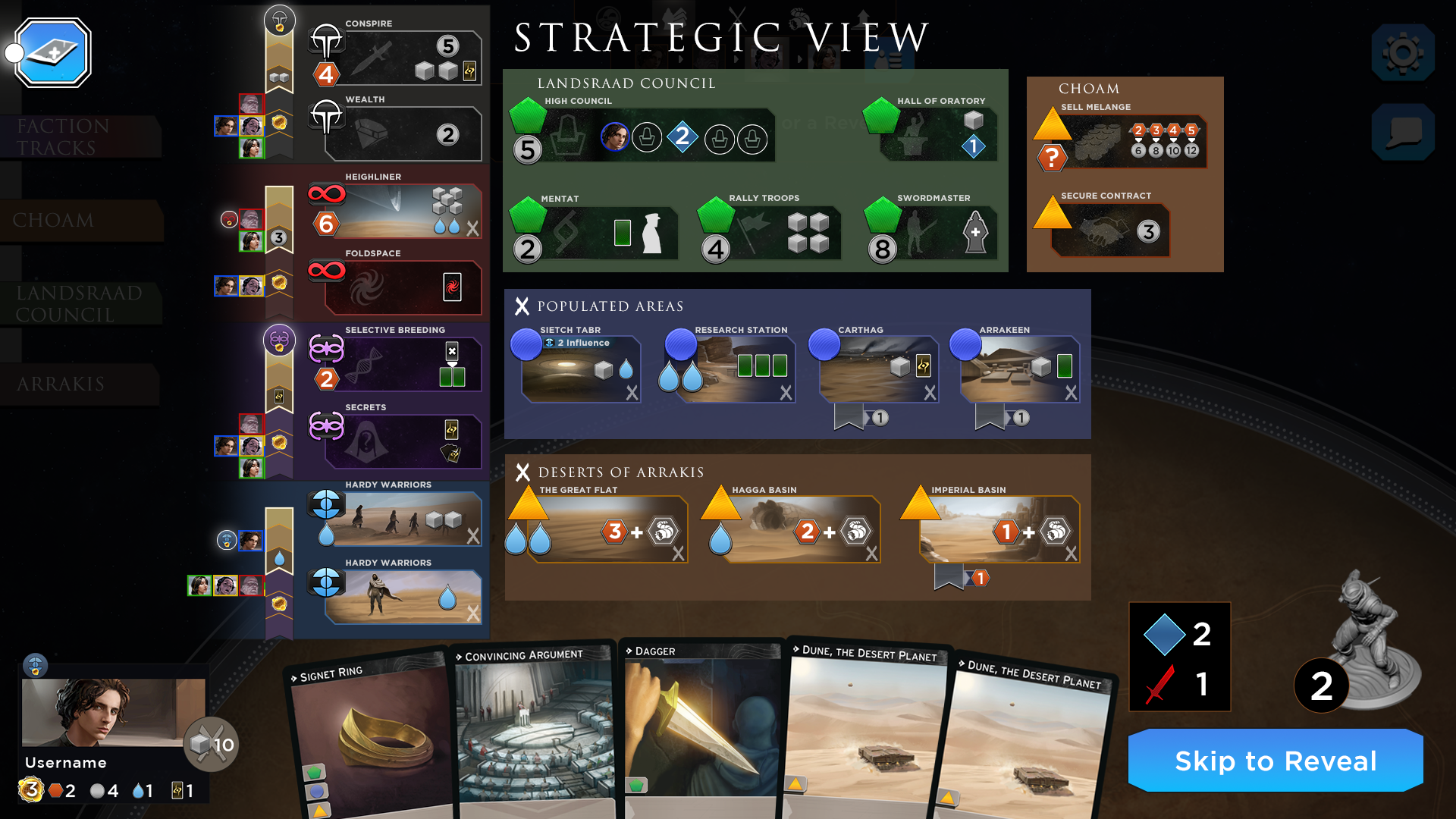
"Strategic view" exploration for full board analysis
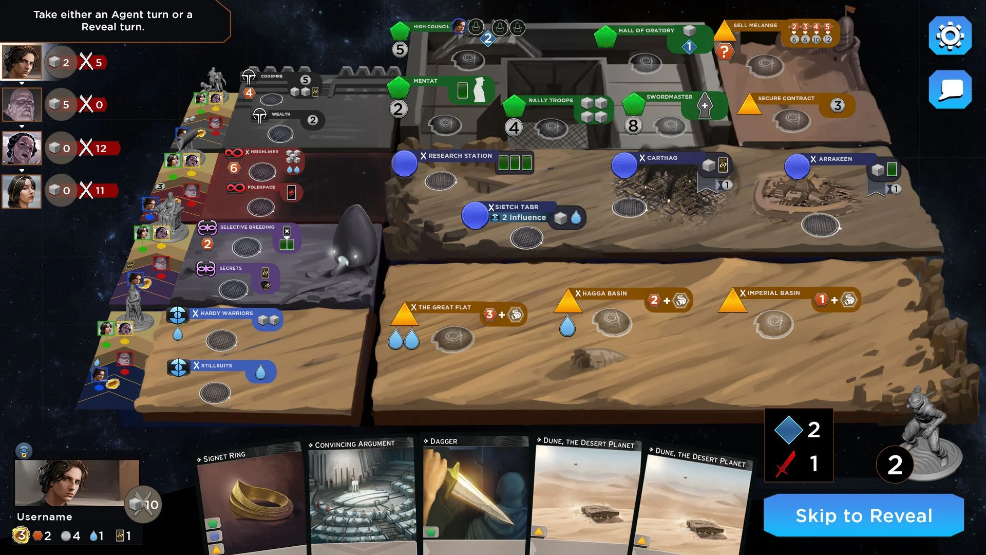
Isometric map exploration, physical section representing each zone
Mix between isometric and planetary perspective, adding conflict spaces
Minimal approach to board spaces

Expanding on minimal approach with stronger faction color backers
Even louder faction color backers with large watermarks
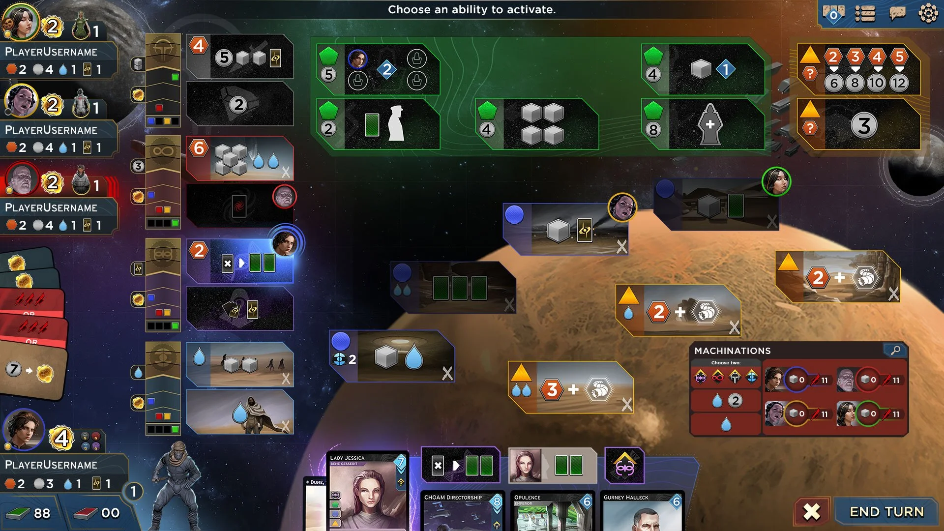
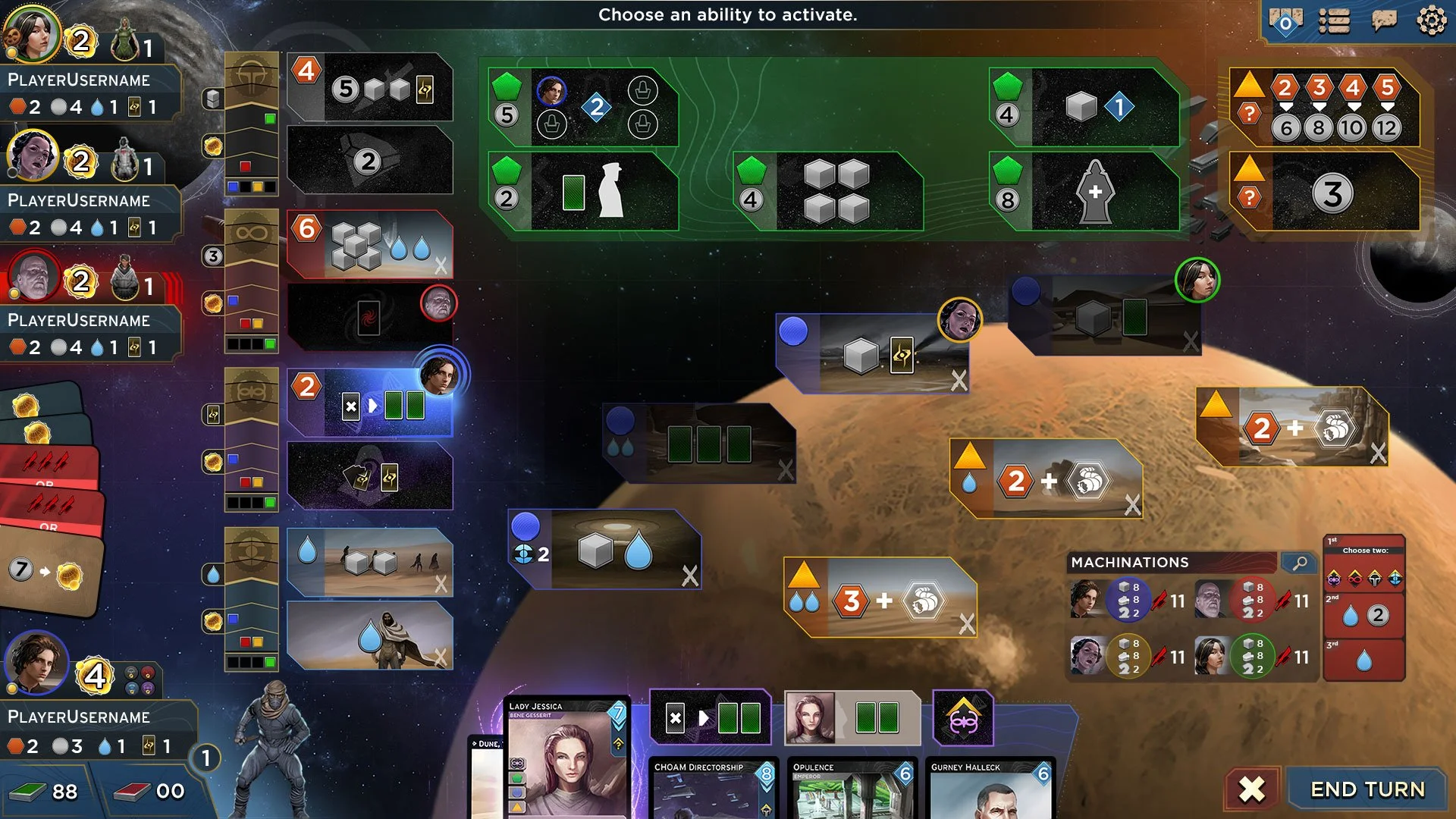
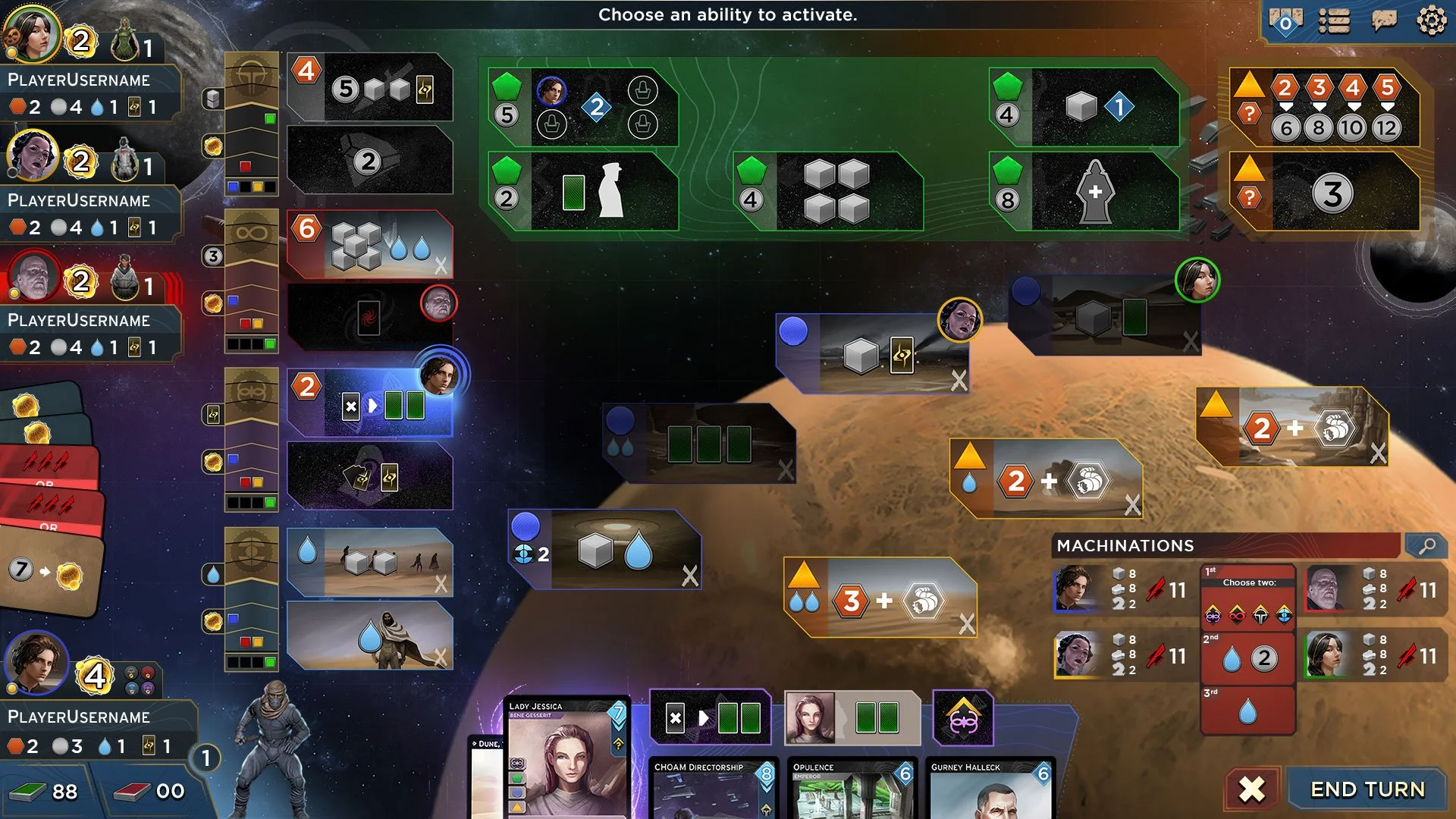
We aimed for a game board layout that was comprehensive for seasoned players while also ensuring that new players had guiderails to learn the mechanics and the interface. The UI is relatively complex so it was very important for us to ensure the sequencing guided players along with satisfying VFX, unintrusive action stingers, and clear graphic hierarchies.
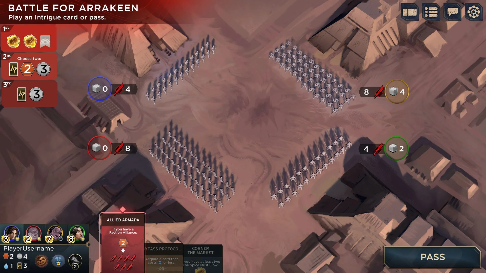
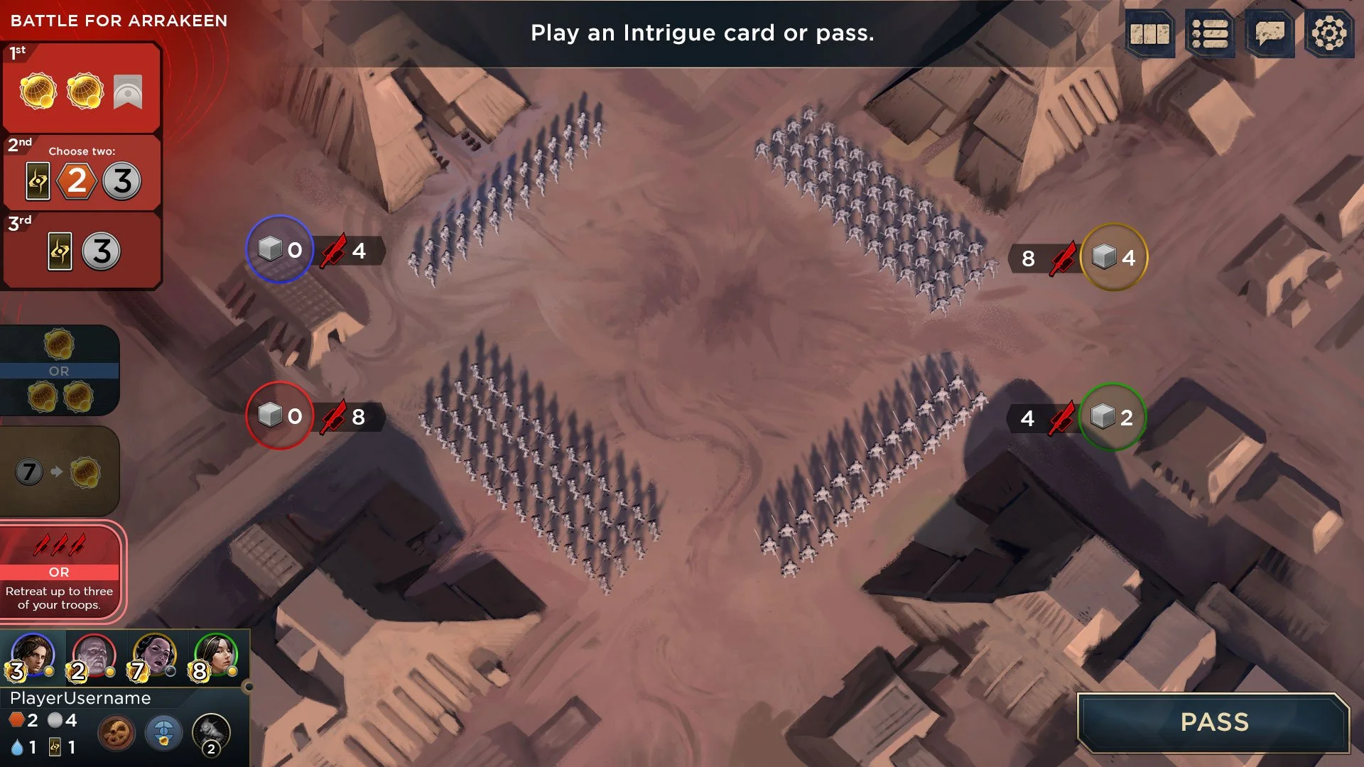
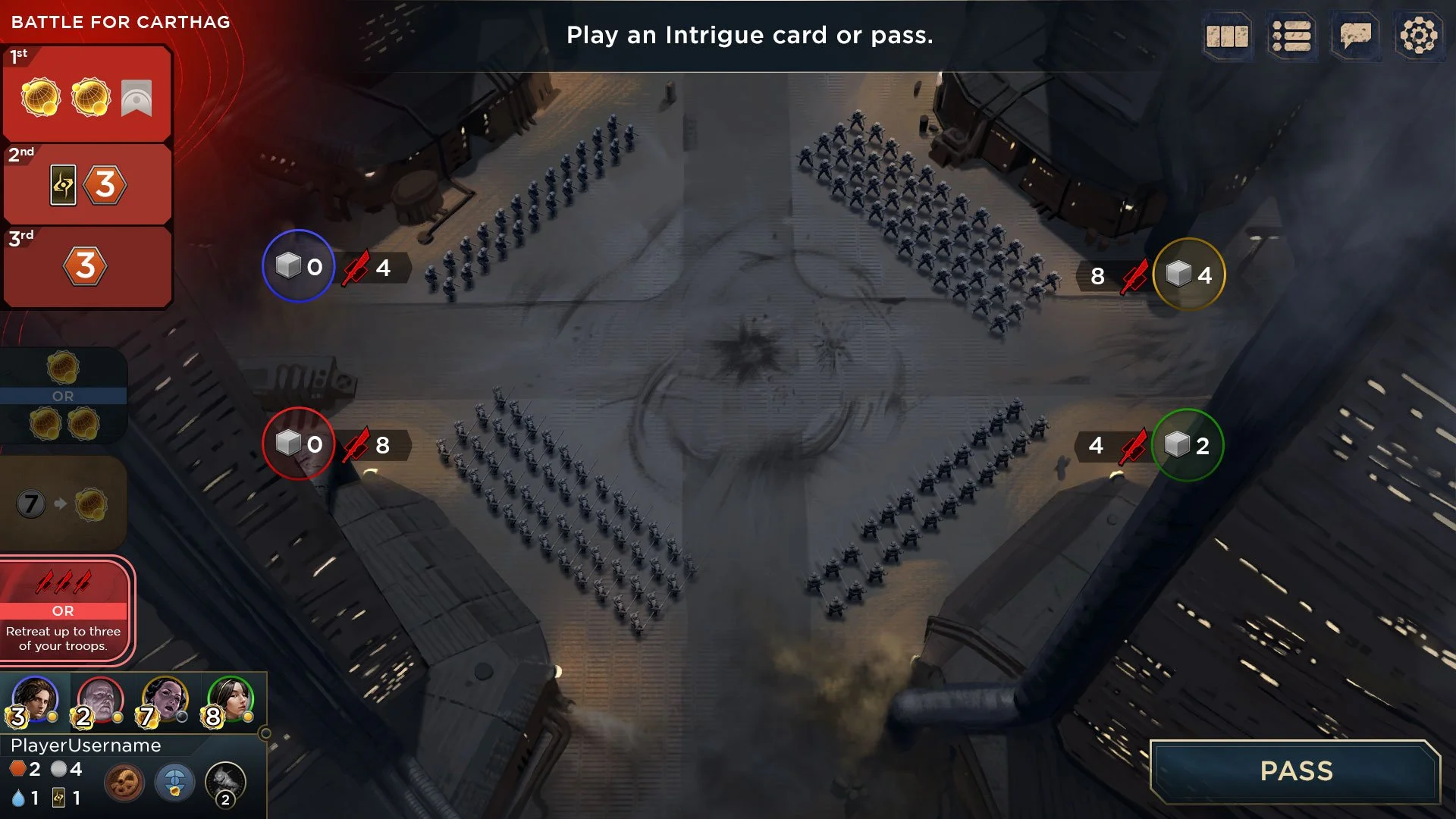
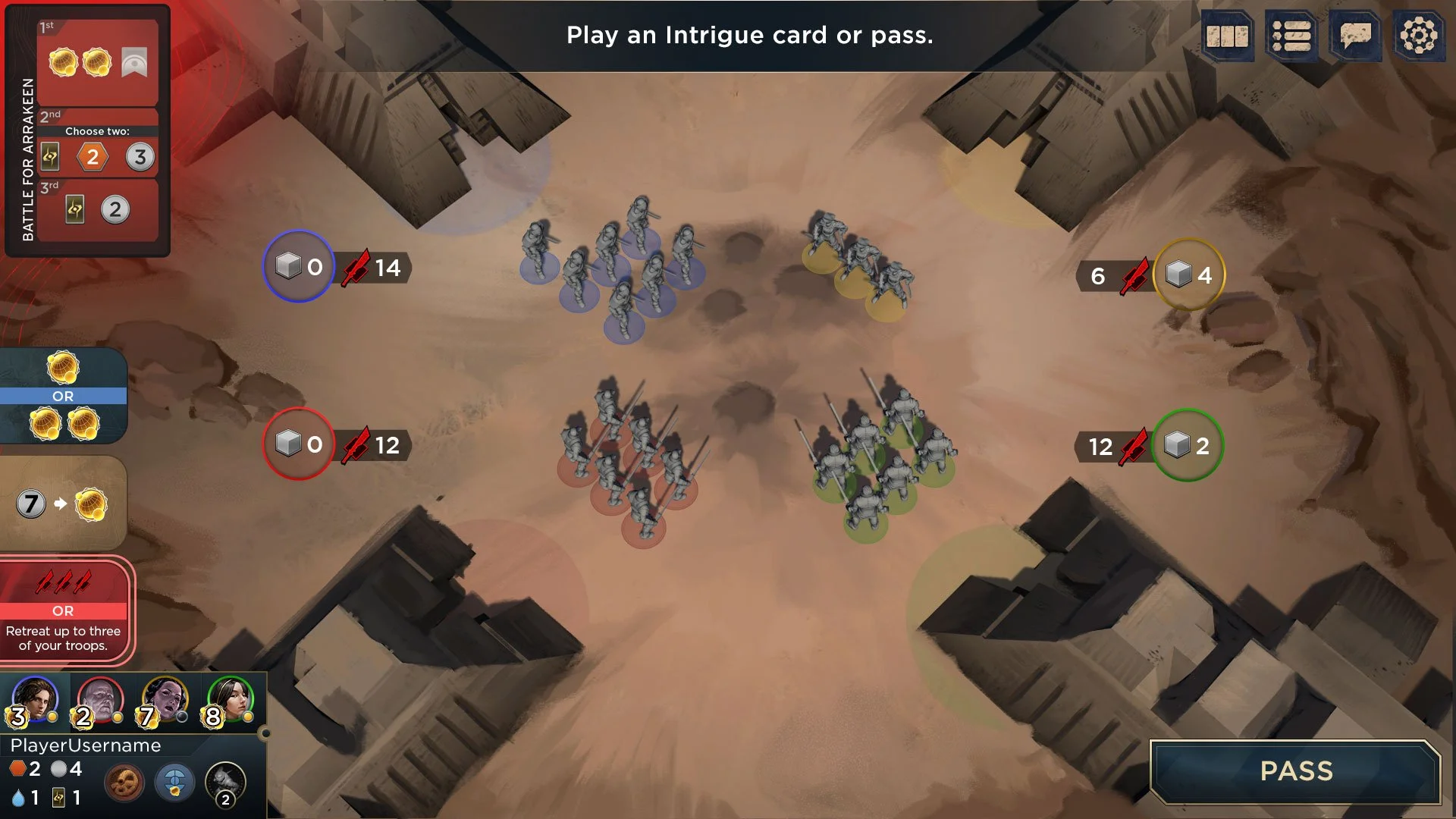
CONFLICT SEQUENCE
When I first approached the conflict UI I aimed for an immersive sequence that brought players closer into the world by transitioning to a close up battle camera where players would commit 3D soldiers into the conflict. The low-level sequence allowed for breathing room and directed player’s focus to the sequence at hand but sacrificed the context of the overall game state. After several iterations and playtesting, we decided that the close-up presentation required too much context switching and added friction to the overall experience. In the end we decided to keep the conflict UI on the top-level so that players would be able to easily check their opponent’s stats and worker placement decisions.
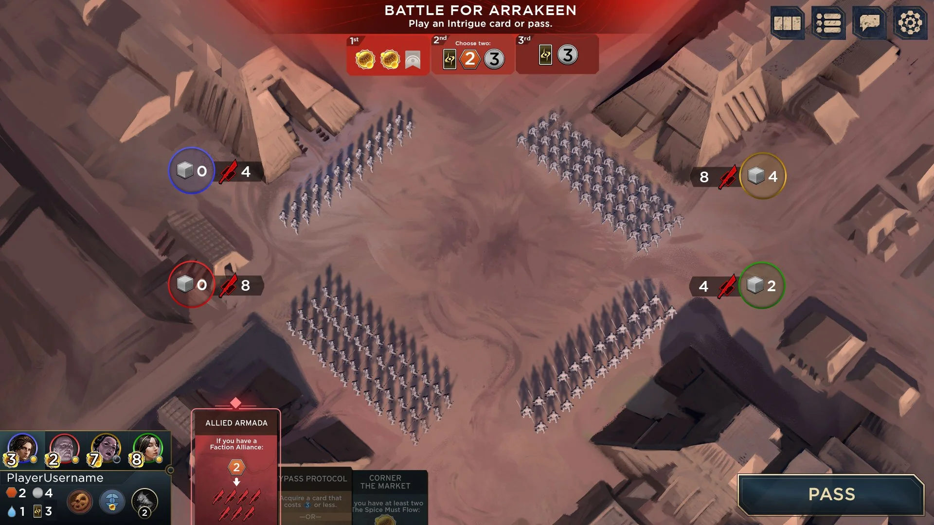
Full 3D conflict sequence with top-anchored conflict UI
Slight variation with conflict UI top-left
To-left conflict UI with left-aligned intrigue hand
Night environment exploration
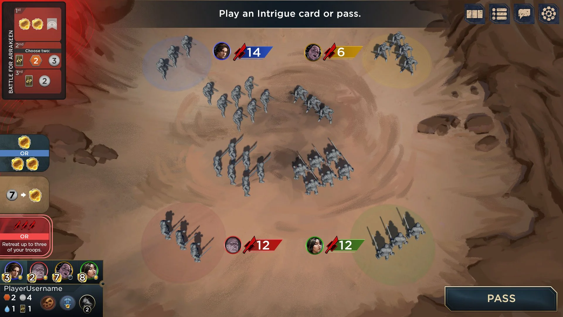
Simplification of armies into larger models representing several units
Slight variation with individual unit coloration and 3D garrison bases
Top-level conflict UI approach using text to indicate army sizes

Variant that retains conflict card orientation on the right
Lighter framing and increased player color indication
Variant with the conflict card in the center of player UI

Adding cube icons from board game for troop indication

Larger icons and numbers, lighter framing
Conflict resolution animated sequence
Final implementation of conflict sequence, deploying troops to the conflict
FRONT-END UI
For the front-end, the goal was to present users with a minimal UI that allowed room for a large thematic illustrations to fill the screen with interest, set the tone, and get players excited. The following mockups were focused on graphic hierarchy as well as style treatments, typography, and iconography.
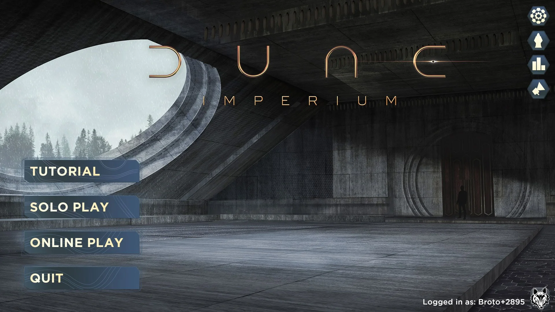
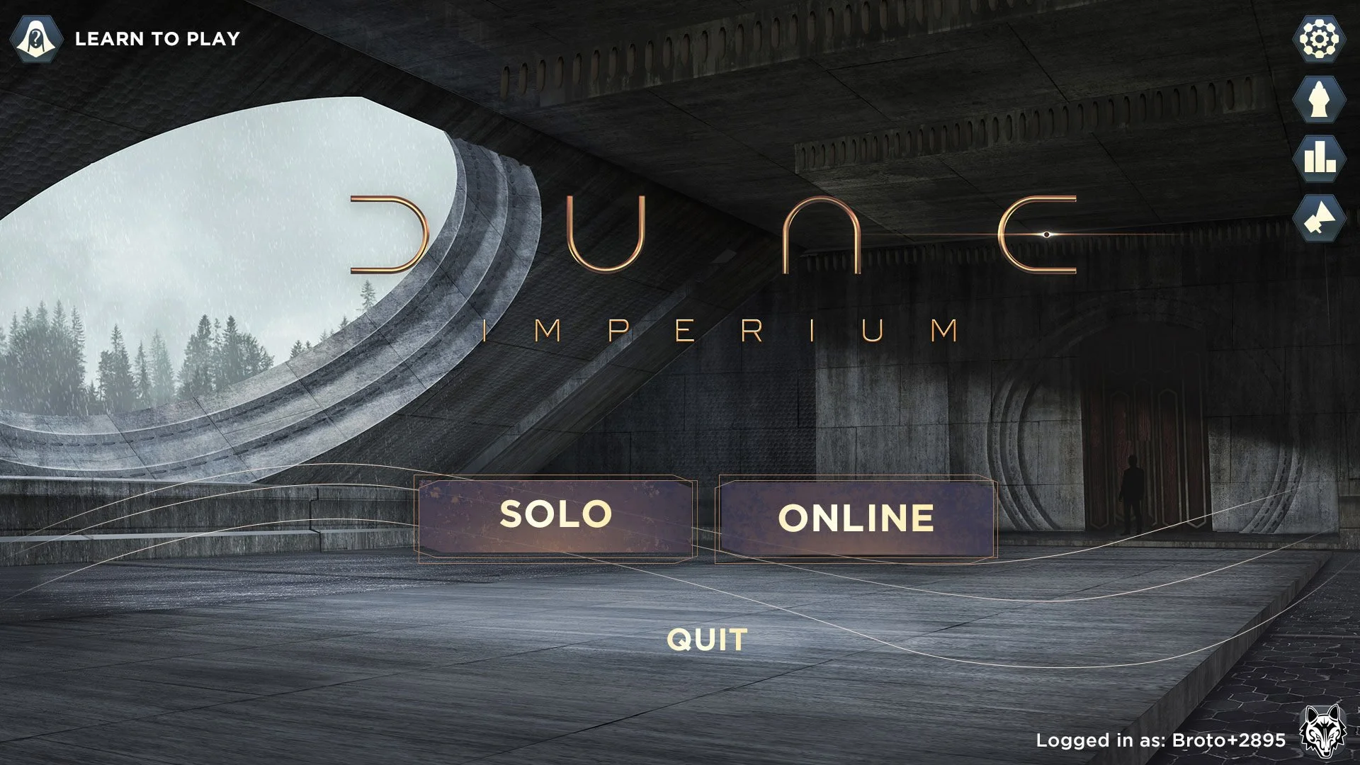
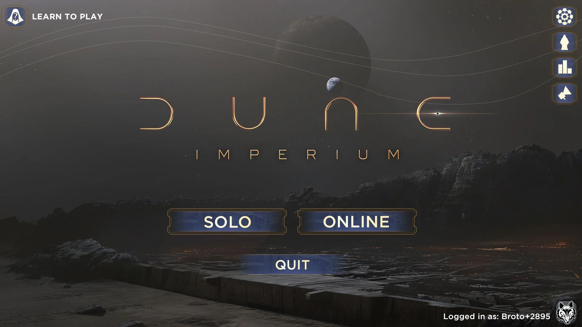
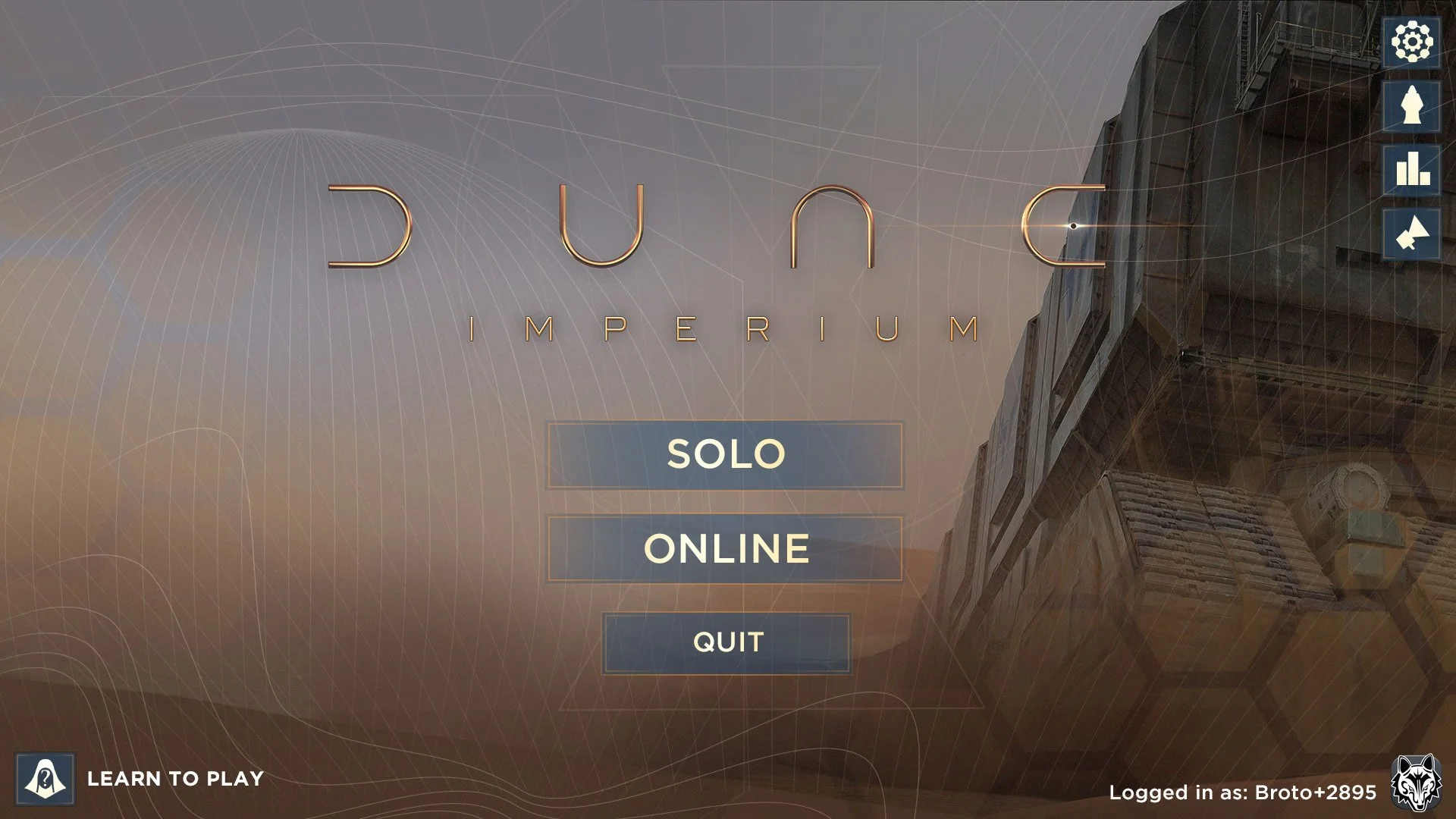
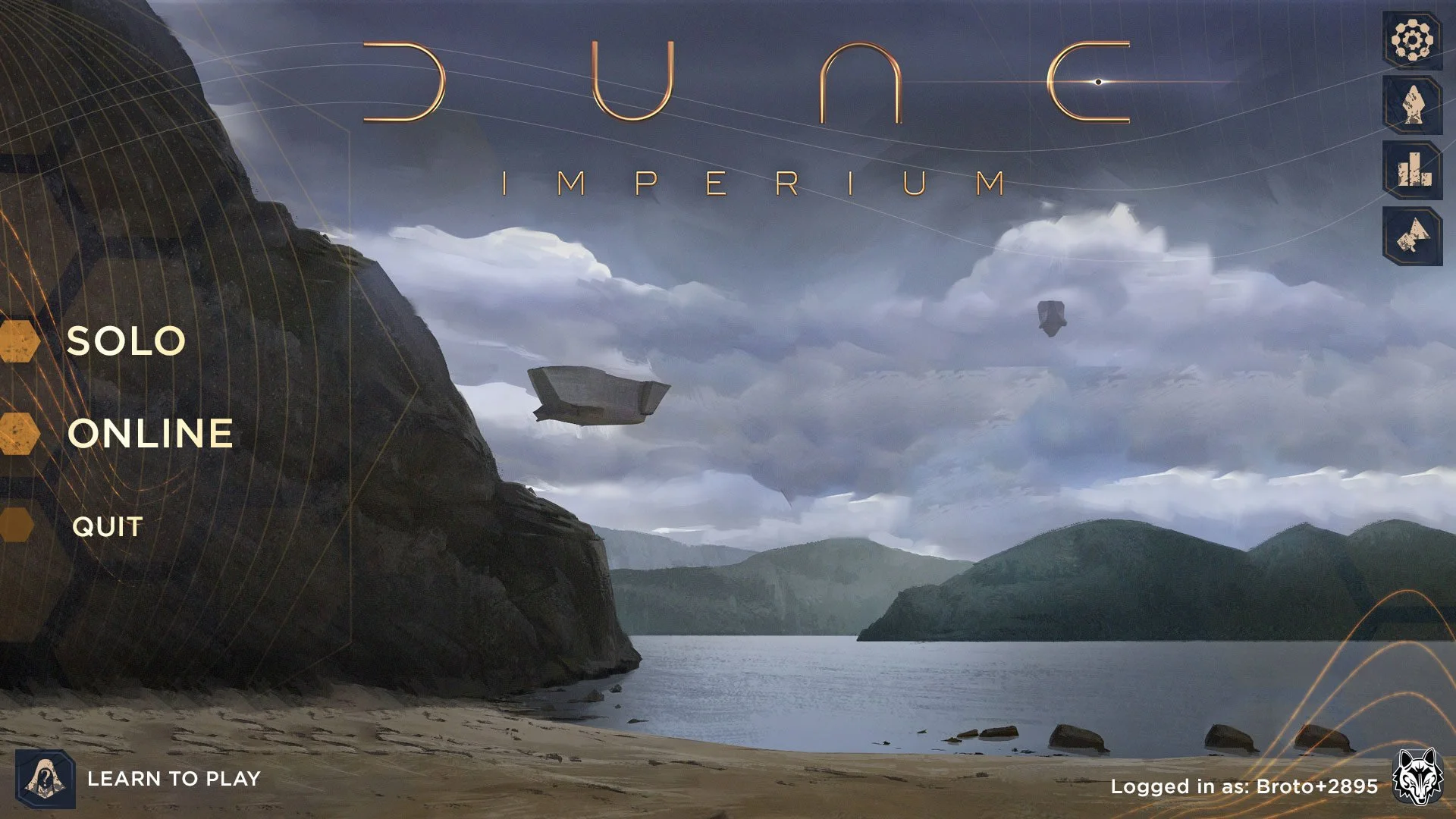
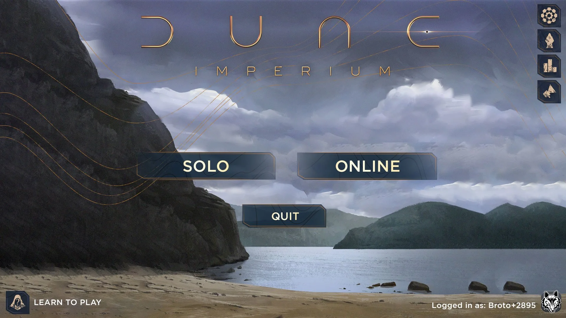
Dune: Imperium is full of solo and multiplayer features that required several screens and user flows. I wanted each screen in the flow to feel like to feel like its stepping closer and closer to battle on Arrakis. It was important to use splashy illustrations to paint the picture of the universe for players while also making each layout feel fresh and easy to navigate.
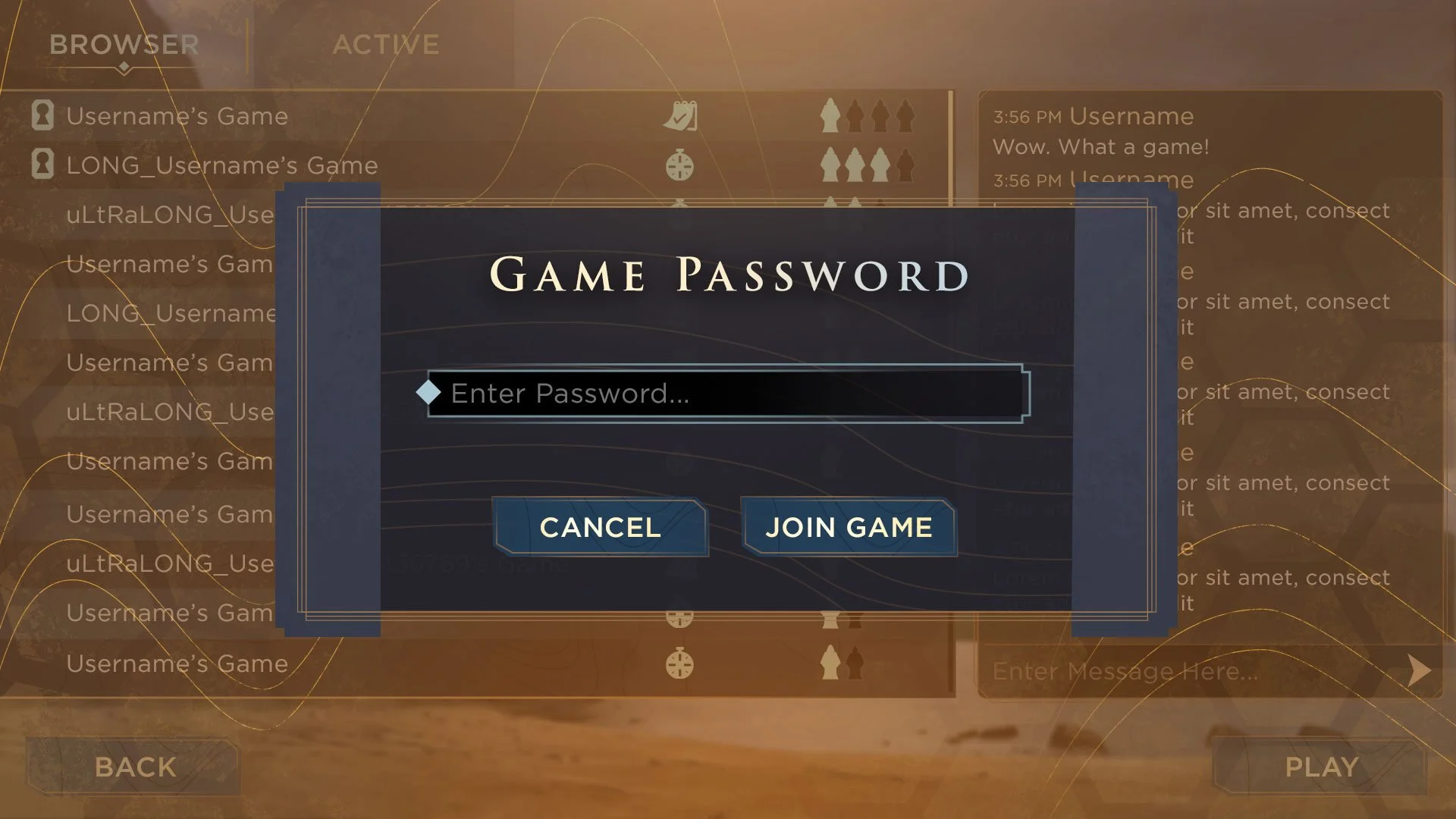
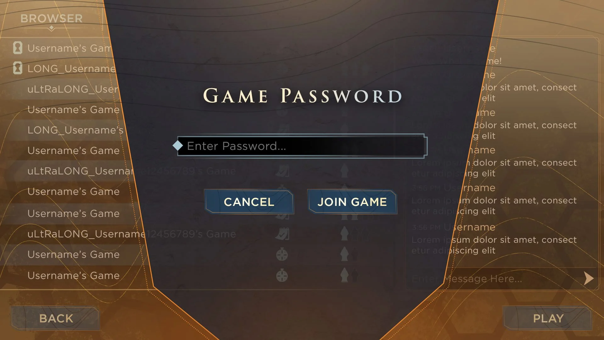
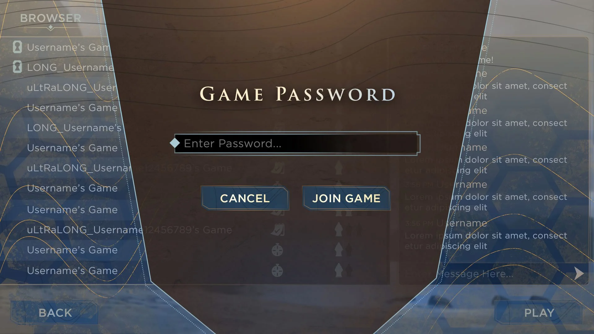
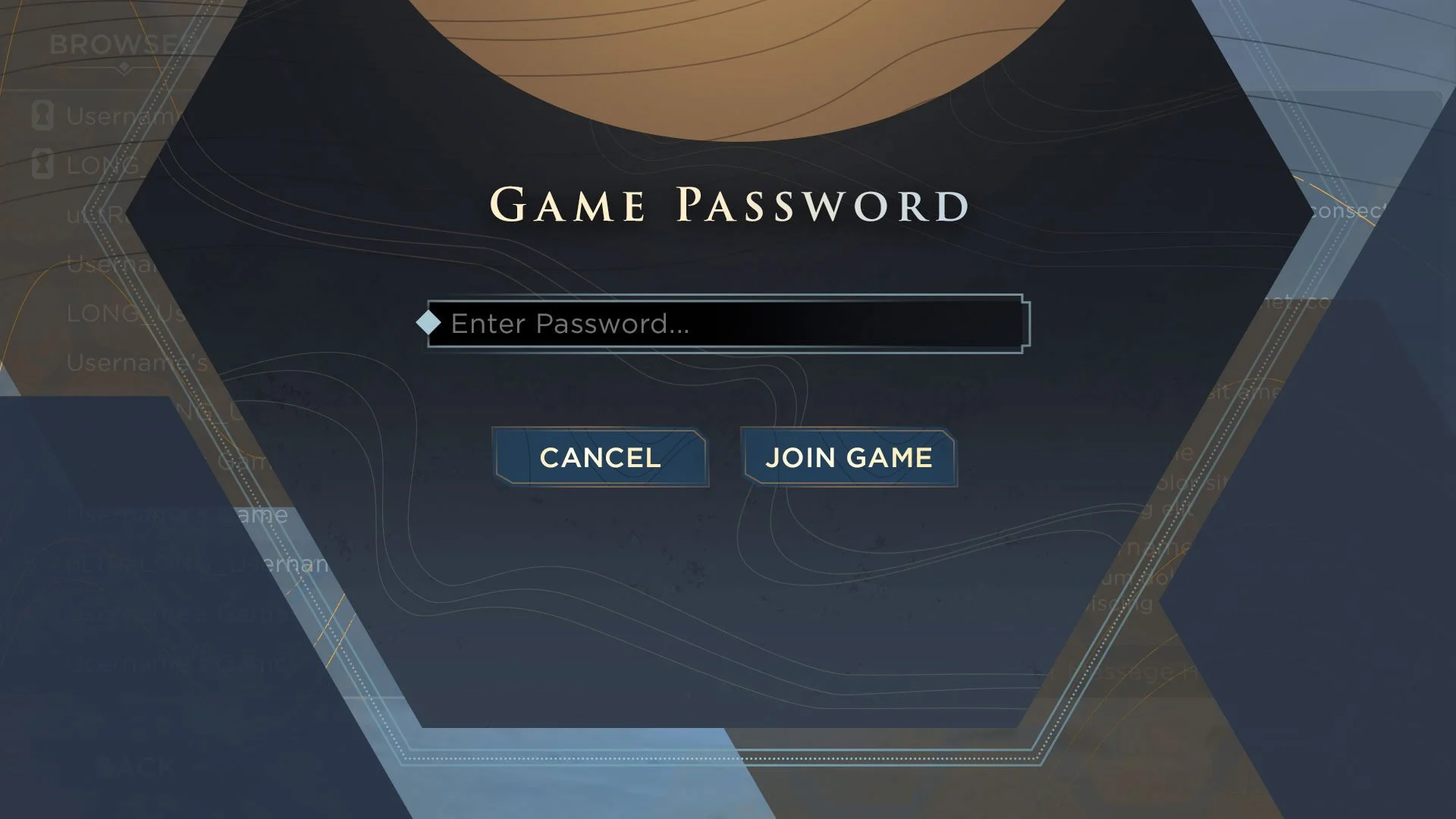
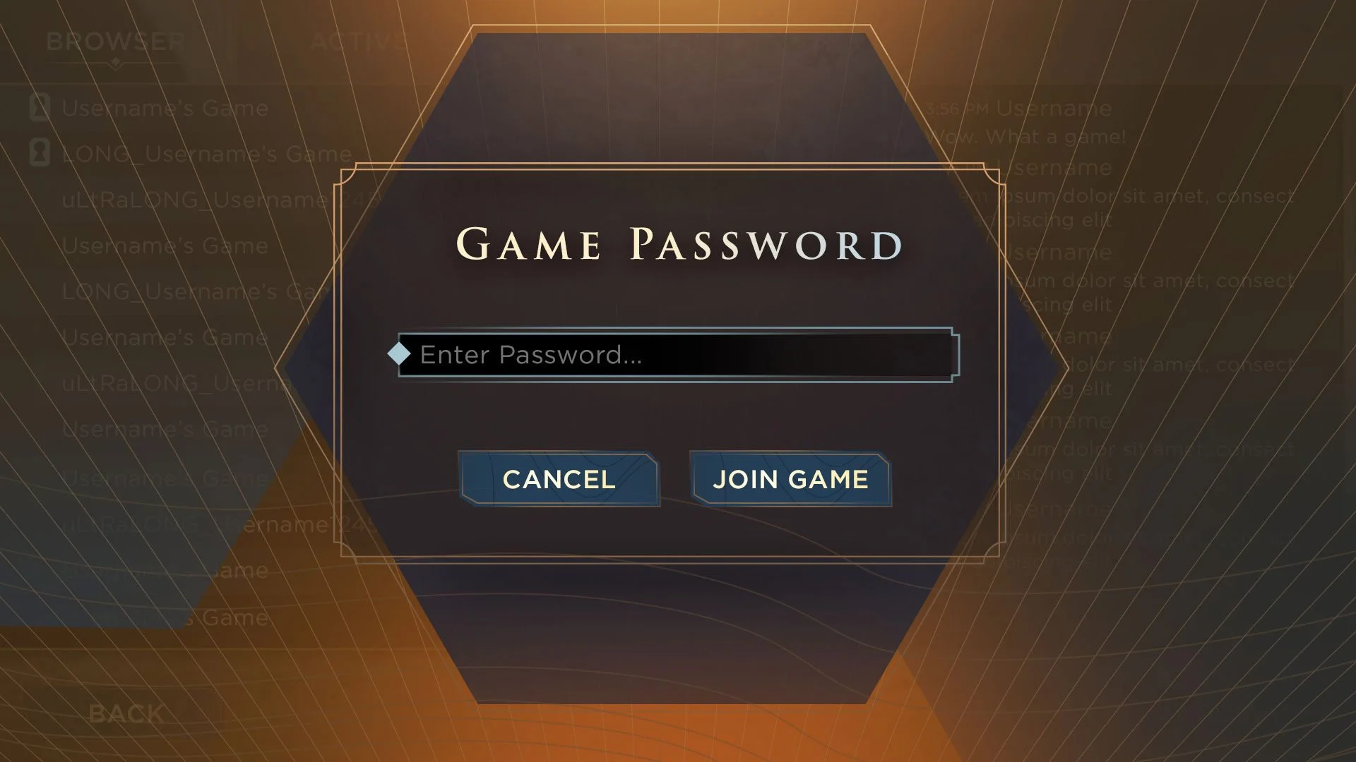
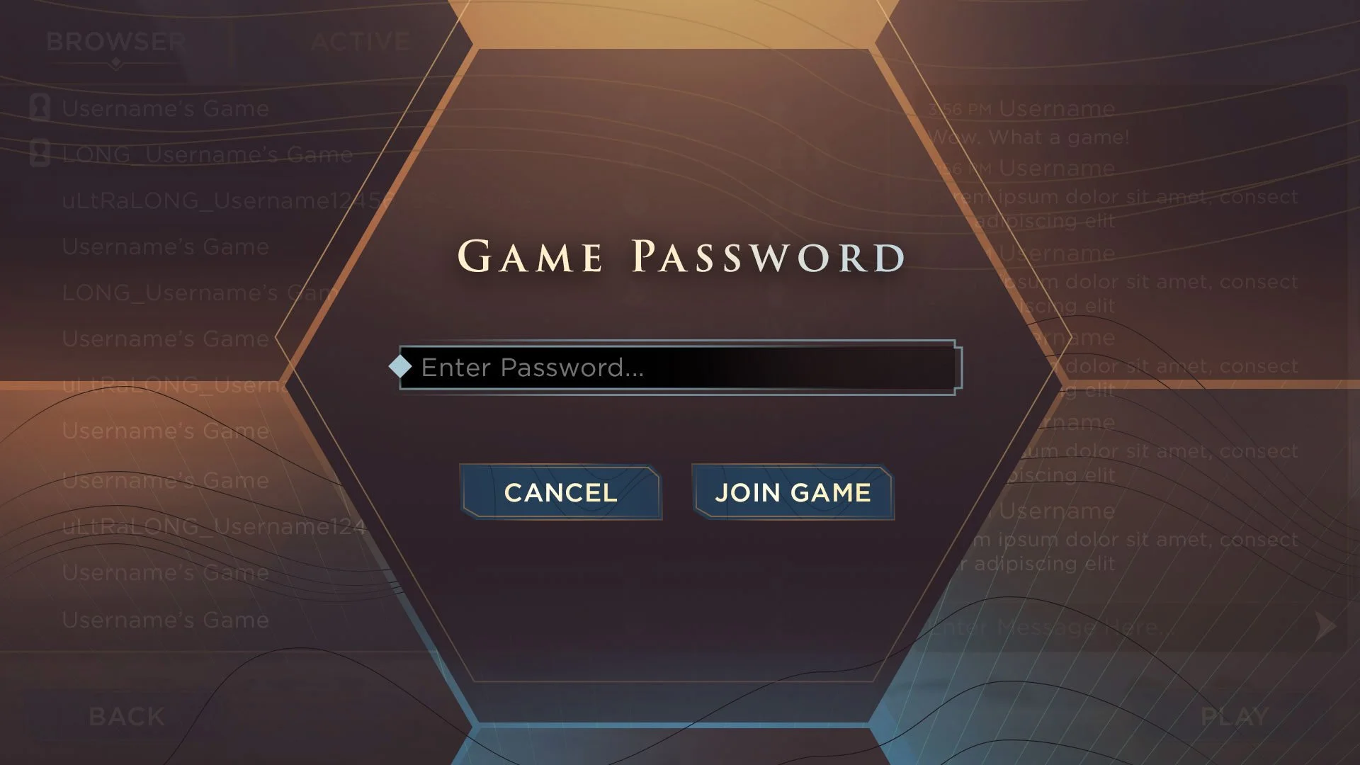
UI STYLING
I generally like to use simple modal screens as a test bed for UI style. In the following mockups I’m exploring color scheme, frame styling, and shape language. A challenge I set out for myself was to find an approach to the general modals that didn’t feel like just another box layered above the primary UI. I wanted a dynamic frame shape that felt sleek and minimal, sci-fi yet grounded. It was also important to create opportunities for elegant animated transitions.